How and why we changed the World Cancer Day logo

An evolving identity with history at its core
Google, Mastercard and Instagram are a handful of household names that have in recent times updated their logo. And, if you were anywhere near social media, it seemed like e-v-e-r-y-o-n-e weighed in.
It’s not easy; this business of changing logos can be tricky. The decision to change from a serif font to sans-serif or to an introduce a new colour, or to tweak a symbol, or to drop (or add) a word can all lead to a slippery slope of controversy, backlash and ridicule.
But, why does a change in a logo (a visual mark or symbol representing a brand) get people so fired up?
Traditionally, a “brand” was used on livestock designating ownership. This practice inspired our modern use of logos – often described as the “face” of an organisation. They have now become a visual shortcut connecting the consumer with the brand, product, campaign or organisation. It’s one part of our understanding, experience and connection with a brand.
We align ourselves with certain brands and hopefully care about them, including the logo.
An organisation’s logo comes with legacy and history, and if there is a visual change in the logo, then it may alter the way we connect with the brand. And, that might be one explanation for why we feel such ownership over a logo.
The internet abounds with cautionary tales of changing a logo. Think about the American clothing retailer, GAP whose logo change hardly survived a week before reverting back to its original version.
So, why tinker, why change?
Simply, the results can be wonderfully beautiful and effective.
Many popular brands have been applauded for their design changes to their logo design, from UBER’s more readable logo to the modernising of Kodak’s iconic mark and even Instagram’s dramatic change - which initially received a tepid response - has hit its stride.
On the surface, design trends change. An aesthetic change helps to freshen up a brand that might be feeling tired. However, at its core, refreshing or overhauling a logo attempts to represent and reflect the brand better and more accurately as the brand, the product or business evolves. It helps that brand to continue to tell a relevant story. And, with World Cancer Day, that’s what we’re striving for.
")
The World Cancer Day logo in real life
Typically, logos are heavily controlled and guarded by the organisation who are the proprietary owners of the logo, with exceptional, limited and privileged use by other organisations and individuals.
That approach runs counter to World Cancer Day. And, we like it that way. The World Cancer Day logo is open for any supporter to use in good faith (and fingers crossed, used intact).
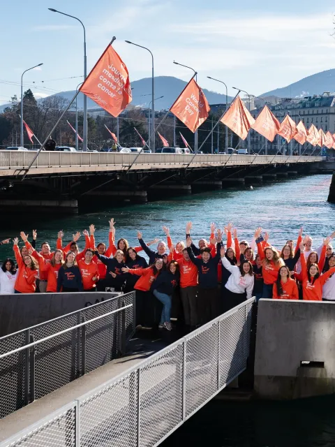
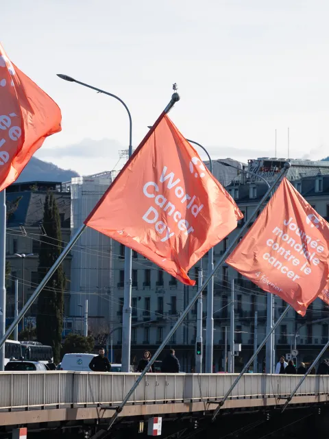
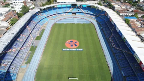
The logo has scrolled across LED screens at charity football matches, it’s been printed on posters, splashed over magazine covers and on six-foot flags, been emblazoned on a winning Formula E car, beamed down as a spotlight in the heart of Paris and featured in a mobile game played by millions of gamers.
")
Why did we change the World Cancer Day logo?
One of the driving aspects of the World Cancer Day logo is its utility and usability in many different contexts and by lots of people – in fact, thousands and thousands of people from all over the world.
This was the previous World Cancer Day logo.
Take a look: there are some solid design elements that work well here. For instance, the round badge and the symbol of the person representing every individual. The brand colours of orange and blue had started to achieve a ubiquitous association with the day.
But, as more supporters use the World Cancer Day campaign materials, including the logo, it made sense to take a look at how the logo was being applied and what – if any – challenges the logo posed for supporters.
Fulfilling its potential
Looking at the logo from a distance, we sometimes struggle to read its details.
Given the way the text is incorporated into the design, this created a challenge to reproduce the logo in different languages.
Additionally, the logo couldn’t be reversed out to a white logo, so as the design stood, it was limited to being placed exclusively on white or light backgrounds.
The logo had potential to be more readable, global and flexible.
Striding firmly into the future
What we aimed with the new logo was to provide elegant solutions to these challenges, while still honouring the past. We wanted to create a logo that (1) would be flexible to fit multiple purposes (2) convey clearly a bold, growing and forward-thinking movement and (3) reflect a diverse, global audience.
This became the final design.
But not before several stages of iteration. We sought to hear from the individuals and organisations who work closely with the logo, including the World Cancer Day advisory group of UICC members, the UICC board, those who were part of creating the original logo, as well as the internal team at UICC.
For some, the new logo looks like a paw print, for others, it resembles more like a rising sun. And, that’s okay. Because we want you to look closer.
You’ll see in fact that we kept the person embracing the world. We’ve kept a part of this history.
We’ve kept the strengths of the previous logo while moving the logo forward towards flexibility, usability, universality and moving it purposely into the future.
Watch the video introducing the new World Cancer Day logo.
The process of change took more than a full year before it was officially unveiled at the World Cancer Congress to a room full of UICC members and World Cancer Day supporters. We took the time to fully consider an important part of the World Cancer Day identity so that we continue to connect, resonate, engage and offer value to our supporters.
However, any logo design on its own is relatively meaningless. It is our actions every World Cancer Day that will imbue the new logo with meaning – of inclusivity, diversity, equity, progress and hope.
Let us know your thoughts on the new logo and share your organisation’s experience in updating, refreshing or changing a logo.
Download the logo
The new World Cancer Day logo is available to download freely by supporters in 50 plus languages here. To help supporters best use the logo alongside their own, download the World Cancer Day brand overview.
Last update
Friday 24 February 2023